Put on your tinfoil hat, folks!
And get ready to explain how and why the moon landing was faked. I mean, it’s not like you could launch a rocket from a round earth, right?
But seriously, I’ve heard multiple times this year, and from several different people that the GTA average home price is somehow misleading. More specifically, I’ve been told that the average home price is being “propped up” by a change in market dynamics.
What do we mean by this?
Well, it’s essentially the “law of averages.”
Let’s explain by using a very rudimentary example.
In fair Verona where we live, every single month, we see exactly ten properties sold as follows:
5 Condo Sales
5 Freehold Sales
Let’s say that condos are worth $500,000 and houses are worth $1,000,000.
This means that the average sale price in Verona is $750,000.
Now, let’s say that the market dynamics in Verona change, and we start to see the following every month:
6 Condo Sales
4 Freehold Sales
Suddenly, the average declines to $700,000.
We can play this game all day, right? Do you see where this is going?
Ignore the small sample size, just for a moment, but recognize that this is something we should talk about just as one of the readers suggested in response to last Monday’s blog. We’re only using a small sample size here to prove the point about how a change in market dynamics can be affected by the law of average, and vice versa.
Now let’s look at the inverse of the situation described above.
What if the market changed and we saw fewer condos being sold in Verona and more houses, proportionally?
Picture this:
3 Condo Sales
7 Freehold Sales
Now all of a sudden, the average home price in Verona increases to $850,000.
But are all the houses in Verona really “worth” 13.3% more today than they were when our split between houses/condos was 50/50?
Of course not.
But this is how the law of averages can affect a particular data set, and there’s a prevailing theory in our Toronto real estate market the moment that the average GTA home price does not “accurately” reflect the market conditions.
So let’s start from here:
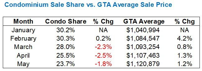
Last month, the average GTA home price increased by 1.2% from $1,107,463 in April to $1,120,879 in May.
Some people, including the odd Realtor, suggest that this is “misleading” because they have seen, witnessed, or experienced a decline in home prices.
But others are quick to note that they’ve lost in bidding wars, or seen houses sell in mere days, and have seen an overall increase in activity.
After all, sales increased by 11.5% from April to May, moving from 5,601 to 6,244.
The question I would ask is this:
Is the data set large enough to account for variables that could manipulate the data unreasonably?
In fair Verona, where only ten properties sell each month, the market average is far more susceptible to variability. But with 6,000 sales every month in Toronto, isn’t our data set large enough?
To that point, let me explain why and when a smaller sample size can mislead you.
I was doing a listing presentation for a builder two weeks ago and I was demonstrating the real change in market value for a “comparable home” by looking at a new-build that sold in August of 2020 and turned over yet again this past April.
I showed him the market statistics that compared August of 2020 to April of 2025, specifically:
1) GTA average home price
2) Toronto-416 average home price
3) GTA HPI
4) Toronto-416 HPI
He asked me, “Can you run the same data for only detached homes and only in C11?”
I told him, “You have four averages right here; two that exist to eliminate seasonality and variability (the HPI’s) and two that are based on several thousand sales. To look at only detached homes in C11 would lead to a sample size error.”
He furrowed his brow and said, “I don’t understand. Just look at the average for detached in C11. That will tell us what we need to know.”
The problem is, there were 10,775 sales in August of 2020, which is a large enough sample size to compare to the 5,601 sales in April of 2025.
However…
…Looking only at detached sales in C11, there were a mere 9 recorded in August of 2020 and only 13 that changed hands in April of 2025!
Regardless of how this data is used, the sample size is simply too small to produce a result that can be effectively and accurately relied upon.
You could have one mansion selling in either month that completely skews the numbers!
So with that in mind, let me return to the theory that’s been expressed over the last couple of months.
Here is what I wrote in last Monday’s blog post:
A colleague of mine suggested that the only reason why the GTA average home price wasn’t lower is because the condominium market is so weak, condo sales are scarce, and thus the average home price is being “propped up” by the fact that there are proportionally fewer condo sales than usual.
I have two hours at the laptop right now, free of children, so I want to dig into the data and see if we can confirm or deny this hypothesis.
Alright, let’s start with a simple data point:
In May of 2025, there were 6,244 total sales and 1,482 were “condominium apartments.”
That’s 23.7%.
Keep in mind, there is a data point for “Townhouse” which considers both freehold townhouses and condominium townhouses, but there are so few condominium townhouses sold, and they are typically at a higher price than “condominium apartments,” that I don’t think it’s worth adding this data point. Not only that, but consistency is what keeps data clean. So long as we’re only using “condominium apartments” across every comparison, then the data will be completely accurate and can be relied upon for our experiment.
So what do we make of that figure above? 23.7%.
Is that a lot? Is that a little? Why is it important?
Well, the average condominium apartment in May of 2025 was $683,413.
Meanwhile, the average semi-detached home was $1,098,447 and the average detached home was $1,425,264.
This infers that, as our example in Verona above showed us, the fewer condo sales we see, the higher the average home price will show.
So what can we compare this data point to?
Let’s compare this to April, for starters.
In April, we saw 1,430 condominium apartment sales amid 5,011 total sales.
That’s 25.5%.
So the proportion of condominiums sold decreased from 25.5% in April to 23.7% in May.
Go back to our example from fair Verona for a moment.
The average home price was $750,000 when there were 5 condo sales and 5 freehold sales. But what happened when condo sales declined?
The average went up to $850,000.
So what happened in Toronto from April to May?
-Condo share declined from 25.5% to 23.7%
-Average home price increased by 1.2%
Here’s where a person could argue:
The real average home value, all things being equal, remained the same. The decline in proportional condominium sales provided a lower number of cheaper sales, and thus resulted in a higher average home price.
Well, hot dog!
Now, let’s look at the trend through 2025:

The share of condominium sales is declining.
This makes sense for several reasons:
1) The condo market is weak.
2) The condo market has become weaker.
3) The freehold market is more cyclical.
4) The freehold market typically peaks in April and May.
But do points #3 and #4 discount points #1 and #2, or do they work in tandem?
Let’s try something.
Let’s look at the proportional condominium sales share in a chart along with the average GTA sale price:
Are there any conclusions to draw here?
The proportional condominium sale share is declining as the average home price is increasing.
Again, one could argue that “fewer condo sales will lead to higher average home prices,” and theoretically, they would be correct.
Once more, consider the average prices in May:
Condominium: $683,413
Semi-Detached: $1,098,447
Detached: $1,425,264
Fewer condominium sales = higher average home price.
The point has been made.
However, we’re only looking month-to-month. Shouldn’t we at least consider year-over-year data and see what evidence it provides?
Let’s look at January through May and compare 2024 to 2025.
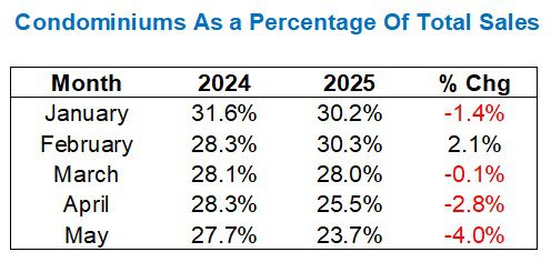
First and foremost, we note that the proportional share is lower in four out of five months this year, compared to last year.
Secondly, we note that the share is declining at an increasing rate as we move through spring.
But to that end, didn’t we just say that the freehold “peak” is typically in April and May?
I would argue that we might come to expect a declining proportional share of condominium sales, based on the freehold peak. However, we didn’t see this in 2024. In fact, the proportional share was essentially the same in February, March, and April, and only declined by 0.6% from April to May, whereas the decline in the same period in 2025 was 4.0%.
But that’s only 2024 vs. 2025.
Let’s look at a longer history:
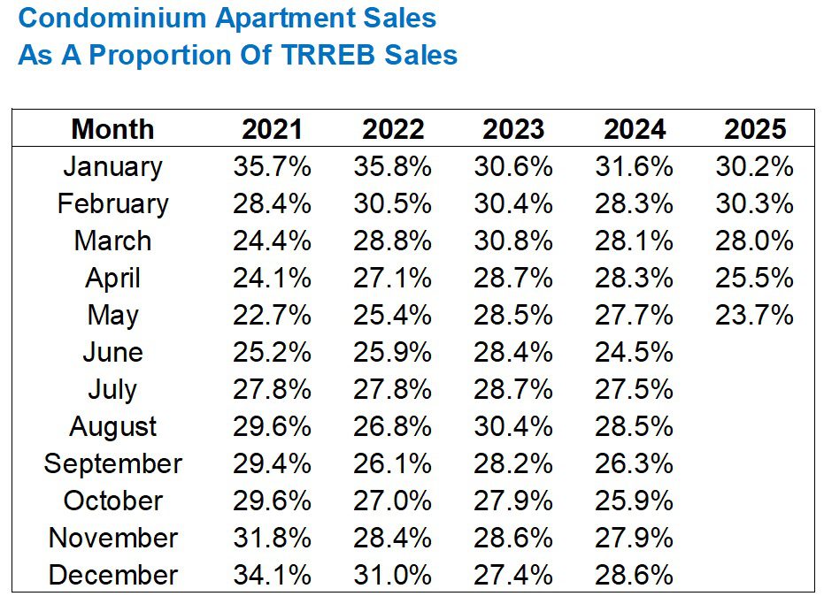
Alright, so many of you are just looking at a maze of %percentage% signs and are moving on.
Read through at your heart’s content, but here’s what I would propose: we need to understand what the 2025 figures mean against all the previous years, not just 2024 vs. 2025.
Let’s take an average of 2021 through 2024 and compare that average to 2025. That is the best way to eliminate a sample size error and answer this question:
Are there proportionally fewer condos selling in 2025 than usual?
Here’s the improved data set:
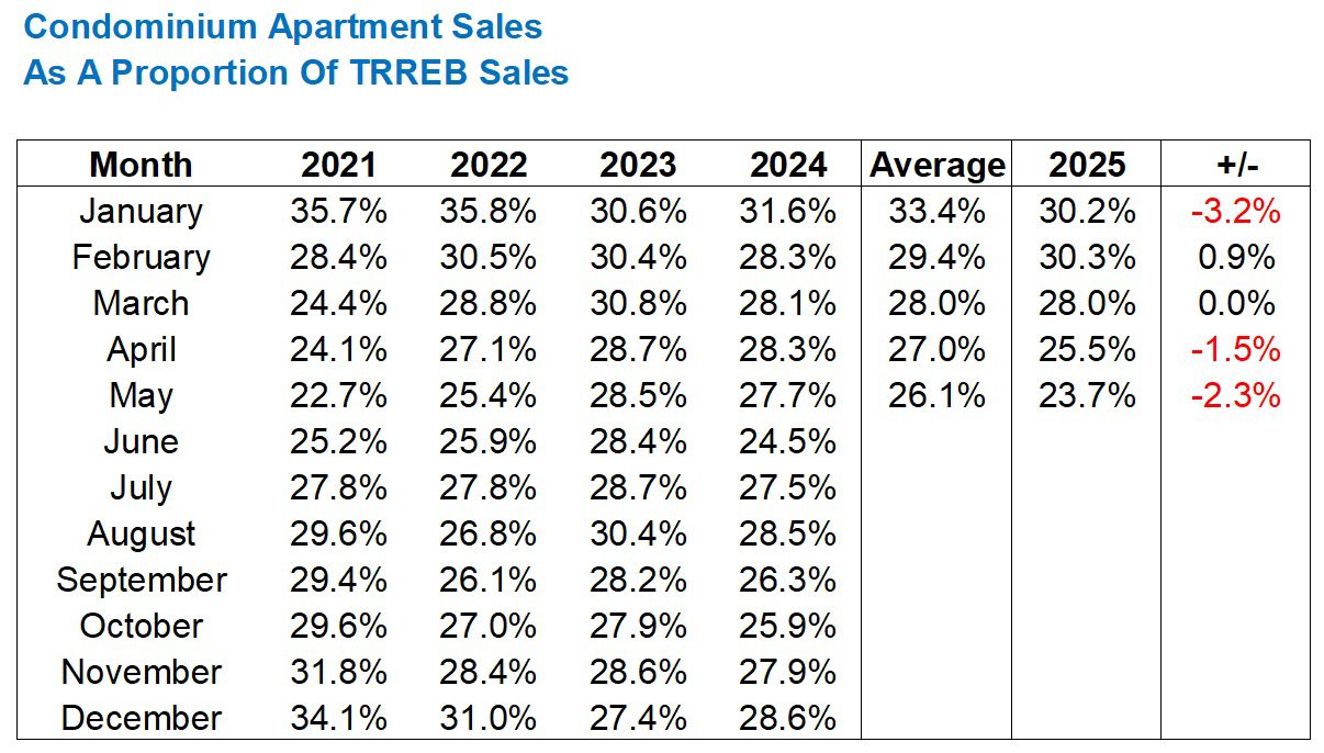
The answer is yes.
Save for February, when a proportionally higher than average number of condo sales appeared, the sales have been lower in three of the other four months, with March showing us a draw.
This would, in fact, lead me to conclude that there are fewer condos selling than normal, as a percentage of overall sales, and thus this could have an effect on the overall TRREB average home price.
How much of an effect?
We can only speculate.
Last but not least, let me demonstrate the share in a graph since a picture paints a thousand words:
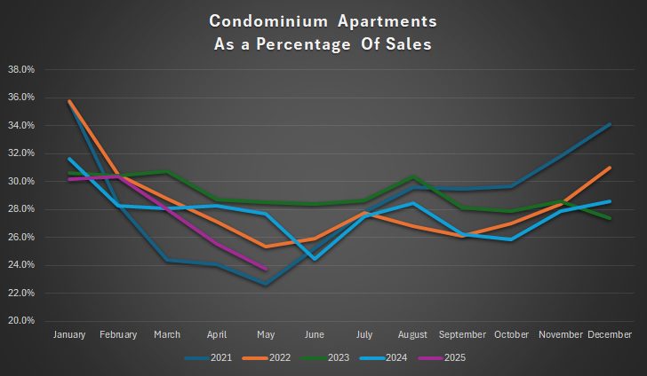
As we can see, the month of May did not provide us with the lowest proportional share of condo sales in the last five years, as the low point was in 2021, but the trend in 2025 has been downward.
Back to the speculation!
I think the following would be fair:
If we saw the proportional share dropping from 35% to 15%, that’s going to have an effect. If we saw the proportional share dropping from 35% even to 25%, that’s going to have an effect. But if we’re talking between 1% – 3%, I don’t know if we should be getting out the tinfoil hats just yet.
In an unrelated story, the new TRREB average, which takes proportional sales share into account, will be called the “Oswald Average,” and I expect long-time blog reader and infrequent commenter Writer to calculate it for us every month. 😉
Happy Monday, folks!


